A new website, a fresh logo, a redefined identity
The same award-winning management company, but with a whole new look and feel.
Visually, it’s a big change, but we’ve only fine-tuned the mission and values that drive us. Our unwavering commitment to building thriving communities remains the same.
We redefined our purpose to reflect what has always been most important to us: Our associates, residents and clients – and we needed a new visual brand identity to match.
Thrive’s updated business purpose is “to create a community where people feel seen because we believe when people feel seen, they thrive.”
Now, what does it mean to “feel seen”? Truly seeing people means taking the time to understand each individual’s unique situation and perspective, and going the extra mile to provide proactive, empathetic and genuine experiences. We embody this philosophy throughout the organization with our associates and our clients, while on-site teams bring the same inspired purpose and energy to the residents at their communities.
Our intent was to visually convey this concept with our fresh and vibrant new branding: A bold type, a creative color palette, symbolic graphic elements and updated photography, all intended to illustrate our most defining element – our people.
Our people – meaning our associates, residents and clients – are what make Thrive, well, thrive. Our refreshed branding introduces components that represent and celebrate these unique individuals.
LOGO – Our new logo was designed to be bolder and more energetic, feeling approachable and refined at the same time. Our signature leaf has been replaced by a sunburst design to visually represent what it means to thrive, both as individuals and as a community. The rays are all unique in color and shape to highlight the beauty and diversity of our people.

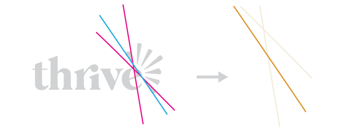
GRAPHIC ELEMENT – The corner design is a brand new element created by tracing a few of the sunburst rays in the logo until they intersect. You’ll see this design used in either a white or neutral line with a pop of color. By creating this additional element we can add visual interest to what would otherwise be plain, uninteresting backdrops, while subtly continuing the celebration of diversity and individuality.
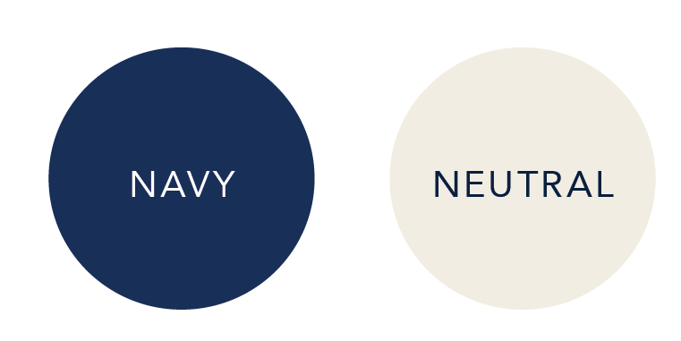
COLOR PALETTE – Our new color palette has been expanded to allow more creative flexibility across marketing materials and visually symbolizes elements relating to Thrive’s journey, roots and values:
Our primary colors define a professional backdrop for branded materials, allowing the bolder hues to shine through with vibrant contrast.
These brighter shades are inspired by the year-round natural beauty of the PNW, a place of importance to all our people, making it a true unifier for Thrive.

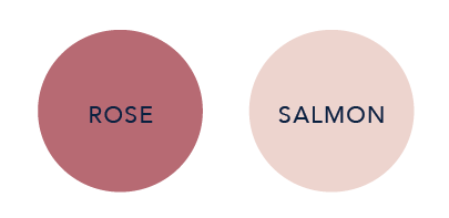
The incorporation of these final colors is a subtle celebration of Thrive being a predominantly women-founded and women-owned company.
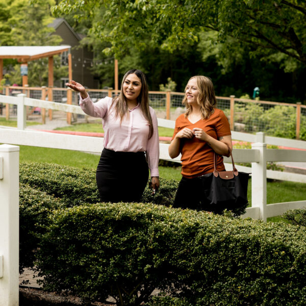
IMAGERY – We’ve also updated our brand photography to focus less on the properties we manage and more on the people who manage them. Our leasing and maintenance teams are the core of our business, and we are proud to have them at the front and center of our new branding.
Our goal is to make others feel seen every day. When another person truly sees you, it feels like validation. It feels like belonging. It feels like permission to be vulnerable – a license to let your guard down and show up as your true self.
Under this reimagined new identity, our people will feel seen. They will be heard. They will be known. They will thrive.
We invite you to check out our new website and see our new brand identity in action! This exciting new face of our company offers improved functionality and revised content covering each aspect of what we do, all with a fresh and aesthetically pleasing design. We will continue to build out additional website content in the coming months, but hope you enjoy the new look and feel as much as we do!

